UX Senior · Platform Migration · Design System
Transforming Uncertainty
into Ownership
Overview
Large-scale betting platform migration — from external agency to internal UX practice. As UX Senior, I led the end-to-end UX process: research, content strategy, information architecture, wireframing, prototyping, usability testing, and a complete design system built from scratch with Rocket Air. The result: a cohesive modernized experience, measurable growth in visits, and UX becoming an internally trusted driver of product decisions.
Context & Collaboration
When this project began, the internal UX team was newly formed and still earning trust — much of the product strategy had been defined by an external agency. The migration spanned multiple product areas with evolving business requirements and high technical constraints. Collaboration was continuous and cross-functional, involving workshops, design reviews, stakeholder sessions, and feedback loops — not handoffs. This approach gradually shifted confidence from the agency to the internal team.
The Problem
The company inherited a complex betting platform with inconsistent interfaces, unclear ownership, and limited documentation. The lack of shared standards and alignment between design, product, and engineering made it impossible to maintain consistency, meet evolving business needs, or deliver efficiently across product areas. UX had no seat at the table — and no credibility yet.
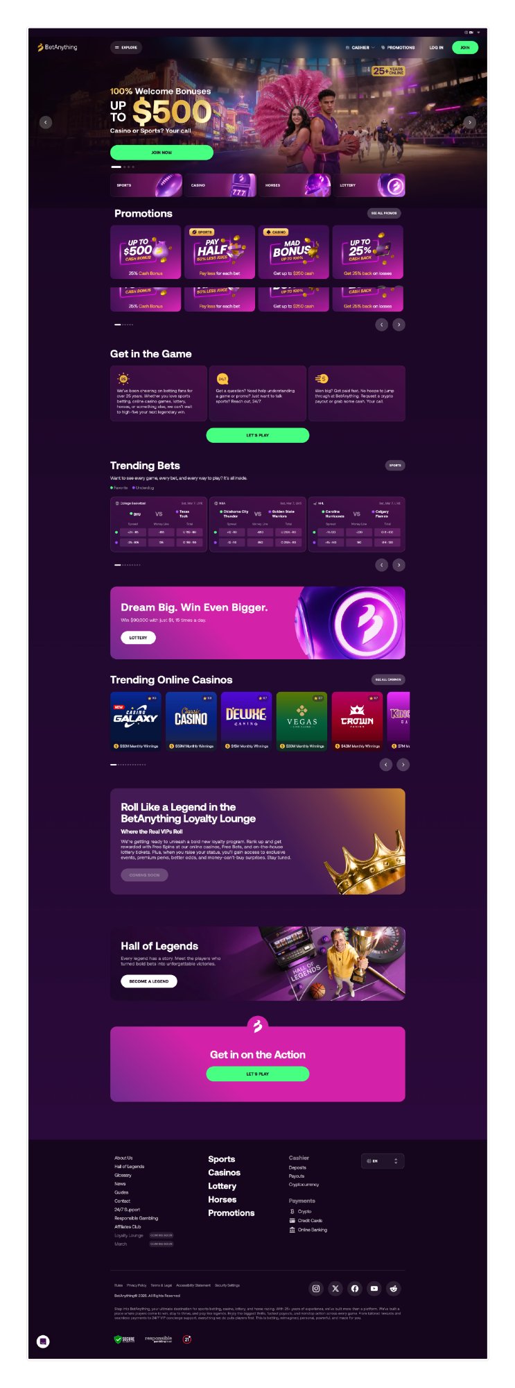
Before / After · Platform
From a legacy platform with inconsistent interfaces to a modernized, cohesive experience with internal UX ownership.
Before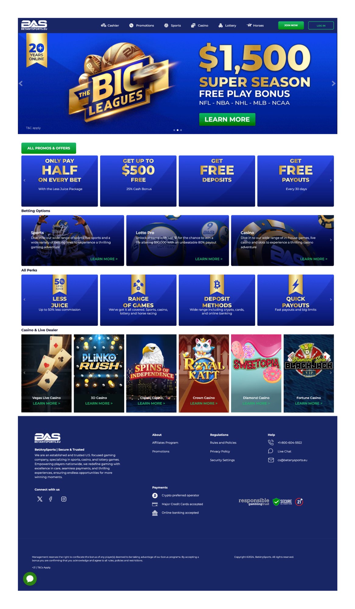
After
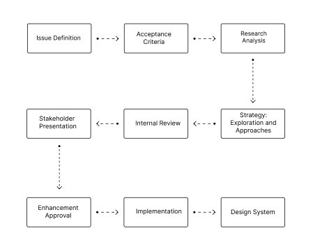
Process
01
Research & Competitive Audit
Betting ecosystem analysis. Identification of UX patterns, accessibility gaps, and differentiation opportunities.
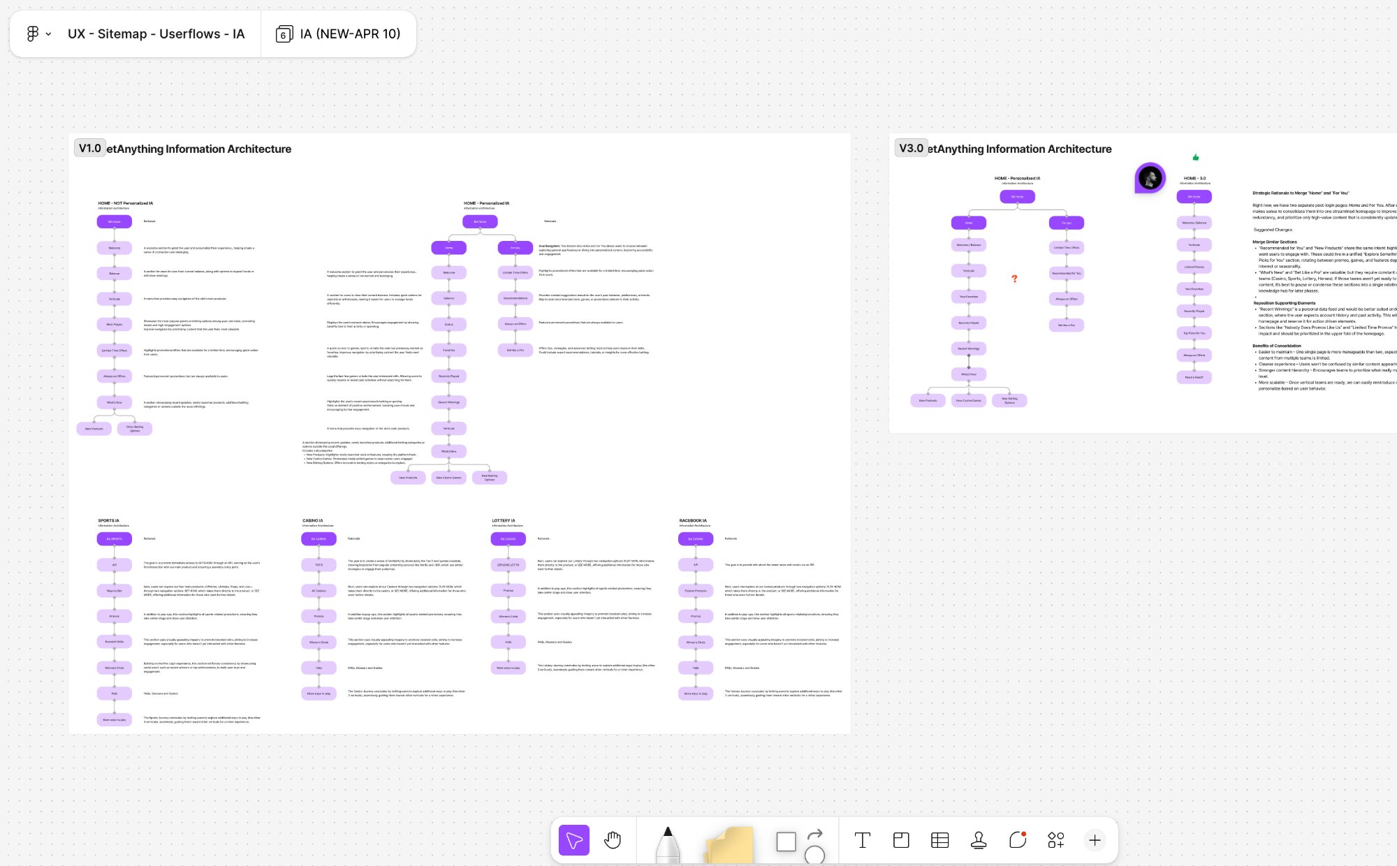
02
Information Architecture & Content Strategy
Complete architecture reconstruction. Sitemaps and userflows Pre/Post login. Content Strategy 2.0 for all verticals.
03
Wireframes & Usability Testing
Low-fi wireframes in cross-functional workshops. Usability studies feeding iteration.
04
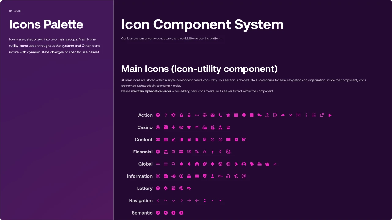
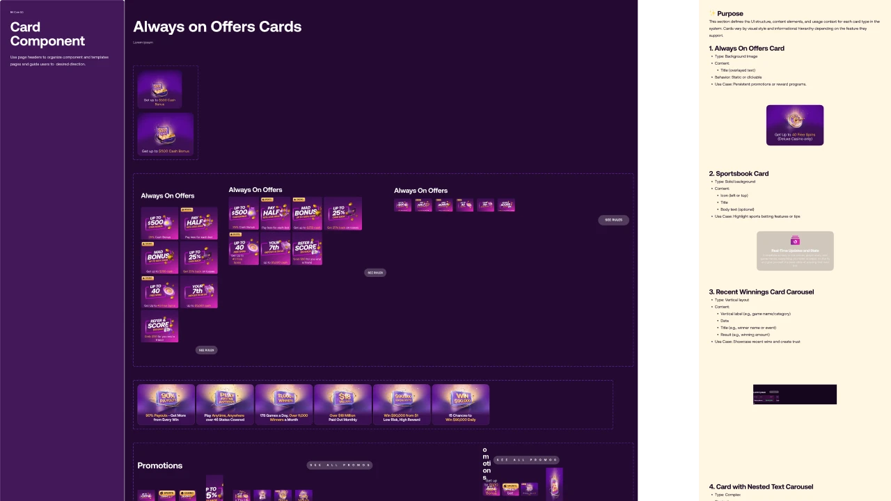
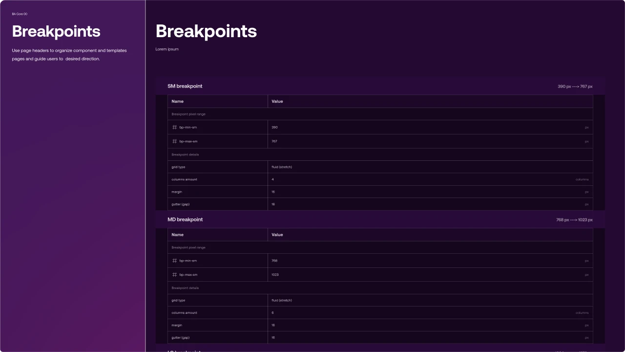
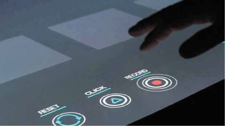
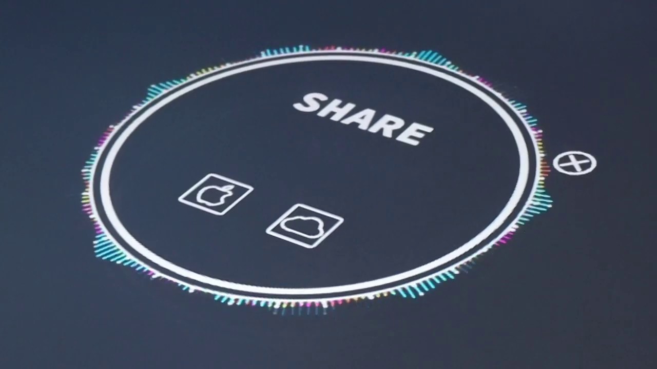
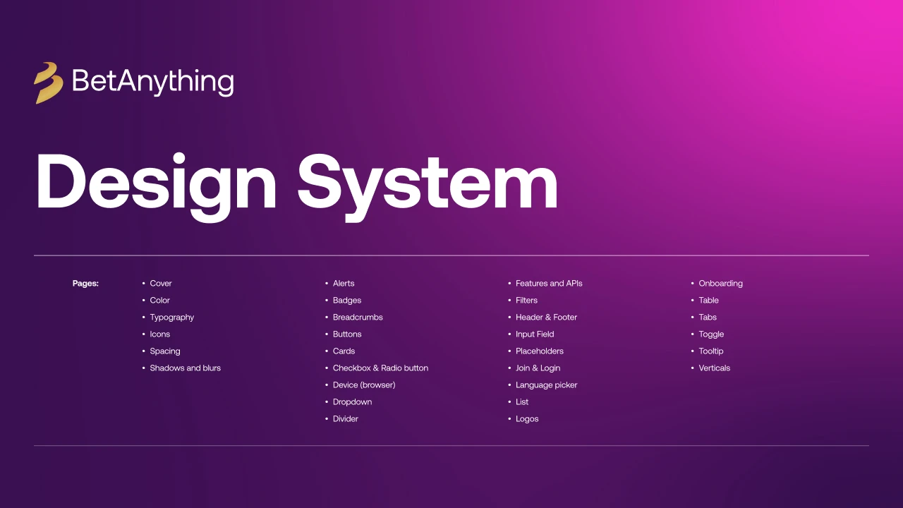
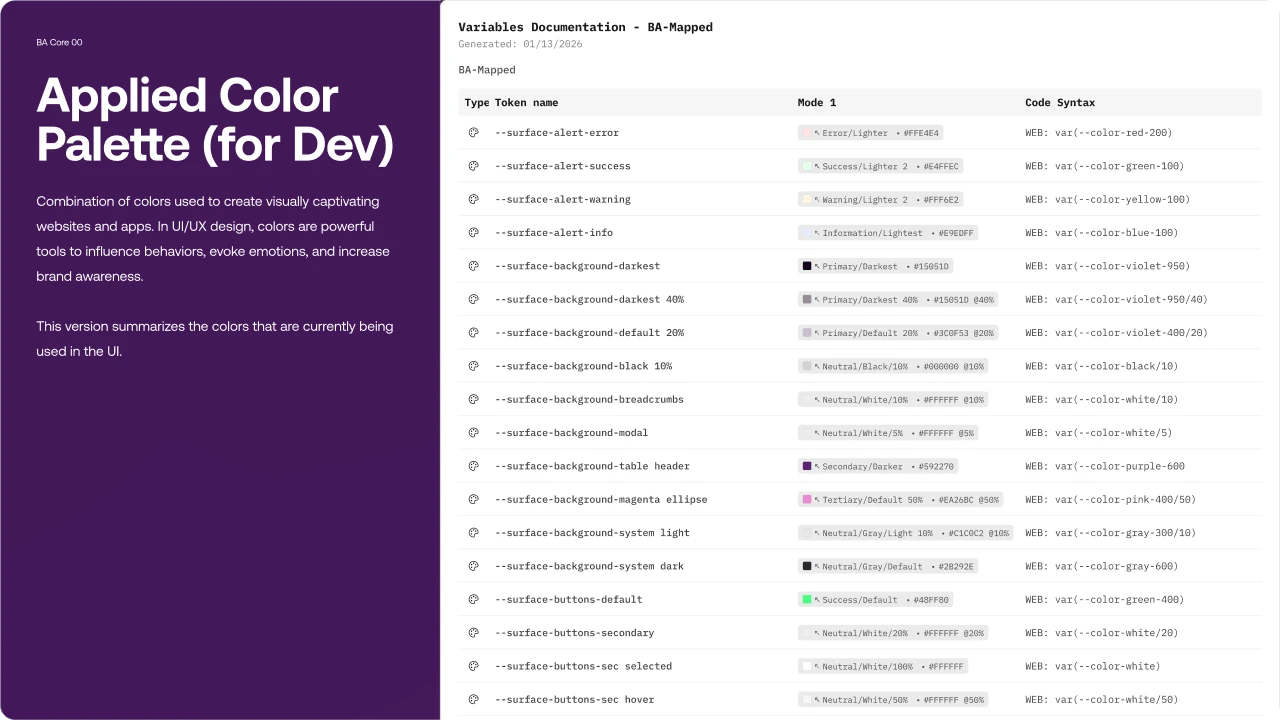
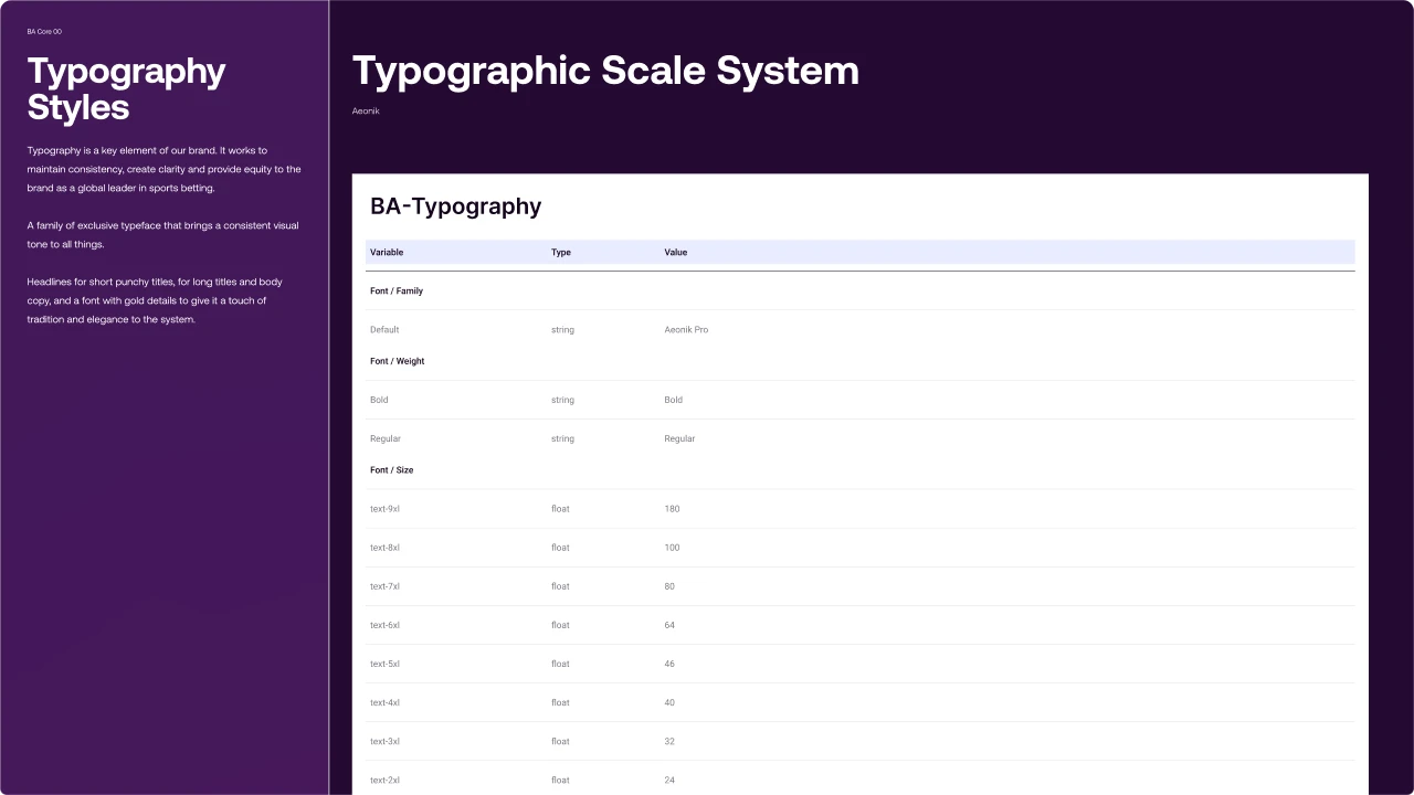
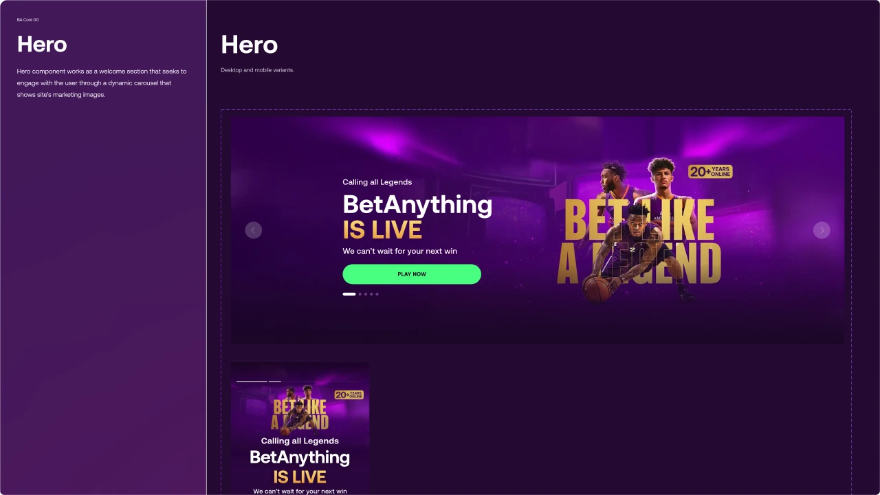
Design System · BA Core
Complete system: Color, Typography, Iconography, Components, Breakpoints. Merged with Rocket Air.
05
High-Fidelity Prototyping & Delivery
Interactive prototypes as source of truth. Handoff to development with detailed specs.
IA V1.0 → V3.0 · Evolución Pre/Post Login
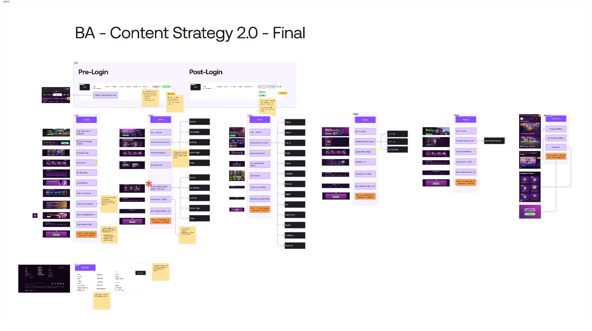
BA Content Strategy 2.0 · Final
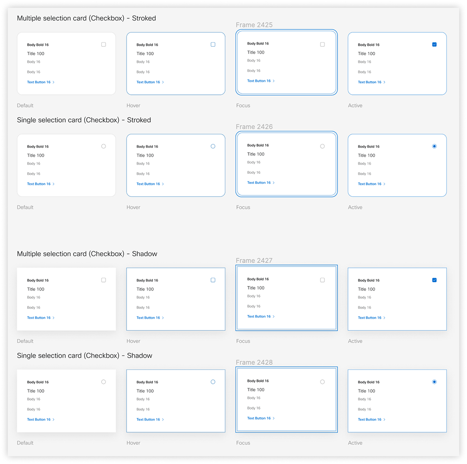
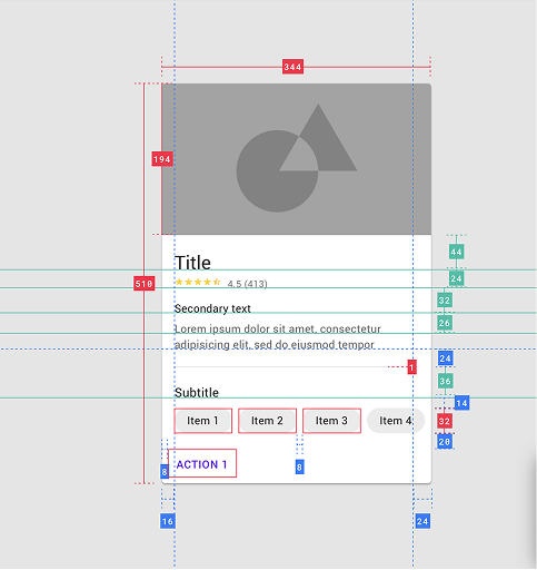
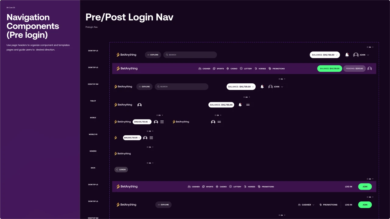
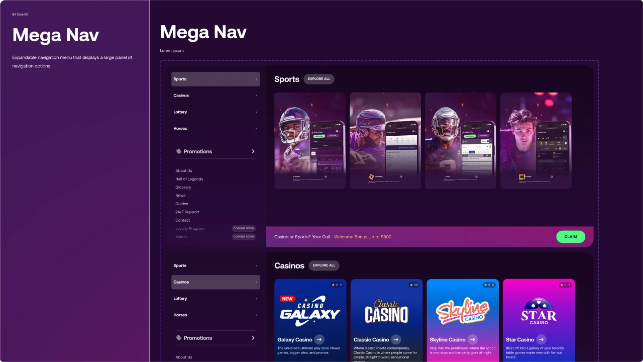
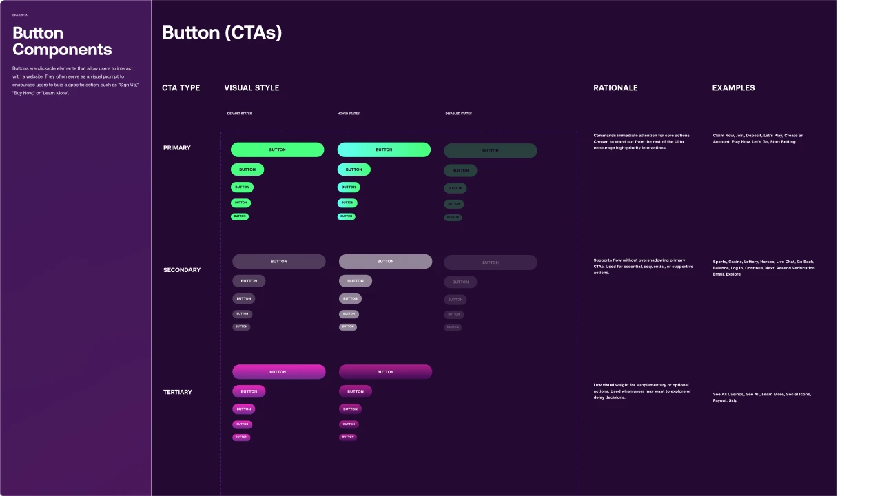
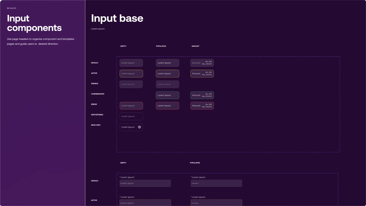
Design System · BA Core 00
Cover · Color · Type · Hero · Navigation · CTAs · Inputs · Icons · Cards · Breakpoints — slide →
Outcomes
Growth in visits confirmed by post-migration SEO data. Platform migrated with cohesive and modernized UX. Internal team gained full UX ownership — replacing the external agency. BA Core design system now powers consistent design across multiple verticals and product lines.
What We Learned
Trust is built incrementally — and UX credibility is earned through consistent delivery, clear communication, and documented decisions, not just great design. The shift from agency-led to internal ownership required as much organizational work as it did design work.
What I'd do differently: establish documentation habits from day one. Every workshop, every decision, every iteration — documented. Well-documented artifacts are what continue to create value long after the project ends.
"What I'd do differently: establish documentation habits earlier. Trust is built incrementally — well-documented artifacts are what continue to create value."
Confidentiality Note
Certain metrics have been modified or omitted due to confidentiality agreements.
